Unread counts
One common misguided feature of mail clients is putting an attention-grabbing red badge somewhere showing the count of unread messages in your inbox (or some other folder). It's worst if it's on the dock badge and you don't hide the dock - then there's no way short of quitting the app to completely avoid this visual interruption. Sure you can just ignore it, but why should you have to?
A quick survey of the three main mail clients I've been using shows that they all have some way of putting unread counts in your line of sight, and only Apple Mail (I use v 3.6 on OS X 10.5) really lets you shut it up - you can tell it not to badge the dock at all. If you had a subset of mail that really does need to interrupt you, you can also restrict the unread count to a particular smart mailbox.
The smart mailbox feature is interesting. It's hard to imagine what kind of email is just important enough to show the unread count for, but not important enough for a more obvious alert. I'm sure the feature comes from a different viewpoint on mail - perhaps the idea is that you'll never read all your messages, so you want to see a count of how many "important" ones you need to read. I think that's just treating a symptom, though, honestly.
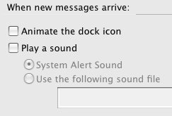
On the other end of the scale, Thunderbird 3 has no way that I can find to turn off the dock badge:
They do give you a way to make it more annoying, though - you can have the dock icon bounce for every new mail! I can't think of any good reason for that, except that at some point when the dock was new, it was fun to make things bounce.
Finally, GMail - I take my GMail more or less straight-up, in a dedicated browser app with no extra frills, that I wrote in 2006 (see post here ). I understand that apps like Mailplane add some nice desktop integration, and multiple account support, but I don't really need that stuff. So, assuming a basic straight-up GMail, it has no dock badge, but it does show an unread count in the title bar:

While that'll show up in some menus and on mouse-over in Exposé, it's really not a big deal. I'd say that GMail (in the browser) and Apple Mail are about the same in terms of visual distraction, once you change the prefs in Mail.
I'd prefer that an email app didn't do anything to make all unread messages look like something important you need to fix. If I'm going to check the mail, I'll notice the messages. If I'm not about to check the mail, I don't want to know. I think this is best for everyone, too - like the insistence on filing vs. searching, it's an outdated habit from a time when email volumes were lower.
Either a message is important enough for a major interruption - a pop-up window with a beep, for instance - or it's OK to let it sit for a while. The unread status alone is a poor substitute for "important", and we should move past it.


Comments
Comments powered by Disqus